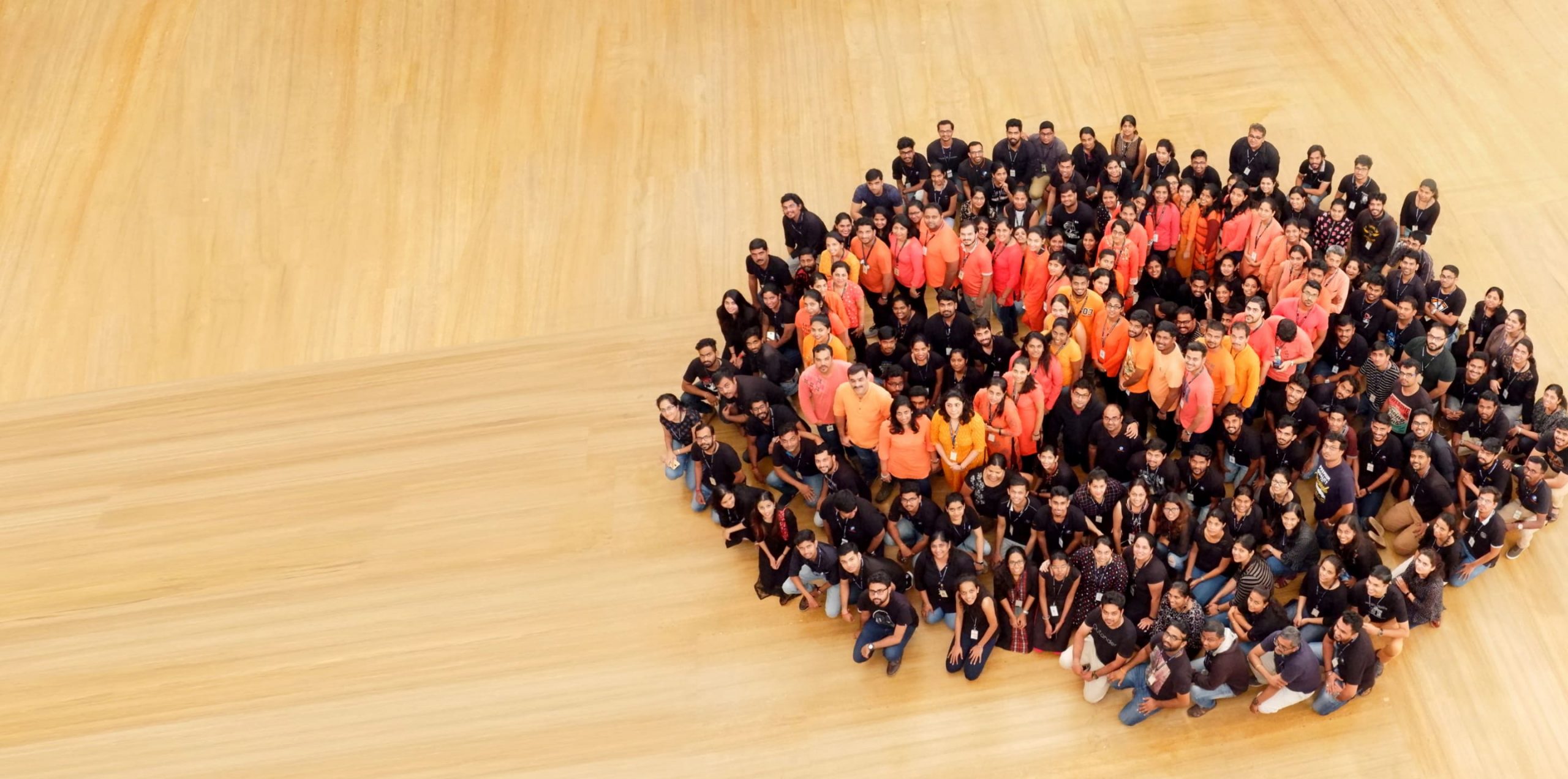
We are a trusted Digital Engineering and Enterprise Modernization partner, combining deep technical expertise and industry experience to help our clients anticipate what’s next and answer questions before they’re asked. Our offerings and proven solutions create unique competitive advantage for our clients by giving them the power to see beyond and rise above.

Awards and Recognitions

Awards and Recognitions

Awards and Recognitions

Press Release

Awards and Recognitions
Awards and Recognitions

Awards and Recognitions

Awards and Recognitions

Awards and Recognitions
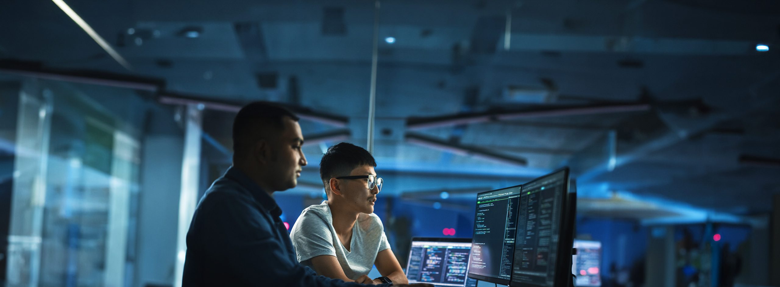
Industry Expertise and Solutions
Service Lines


Persistent Leadership
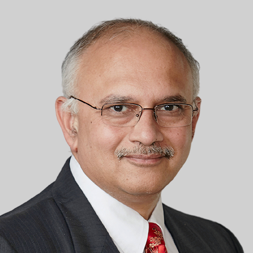
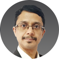
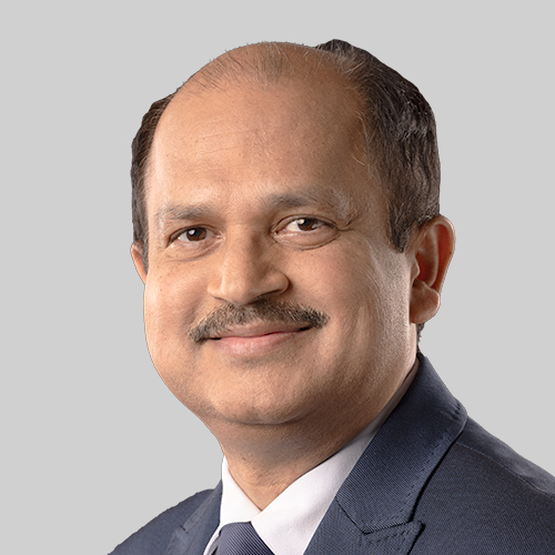
Dr. Anand Deshpande
Founder, Chairman and Managing Director

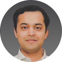
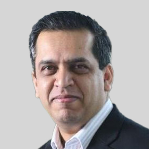
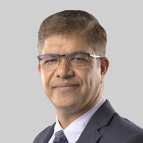
Sandeep Kalra
Executive Director & Chief Executive Officer
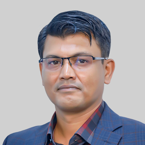
Vinit Teredesai
Executive Director and Chief Financial Officer

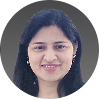
Avani Davda
Independent Director
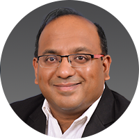
Arvind Goel
Independent Director
Dr. Ambuj Goyal
Independent Director
Anjali Joshi
Independent Director
Praveen P Kadle
Independent Director
Dan’l Lewin
Independent Director
Dr. Ajit Ranade
Independent Director
Sandeep Kalra
Executive Director & Chief Executive Officer
Vinit Teredesai
Executive Director and Chief Financial Officer
Jaideep Vijay Dhok
Chief Operating Officer – Technology
Tom Klein
General Counsel
Rajiv Naithani
Chief People Officer
Mukesh Agarwal
Chief Planning Officer
Hari S. Abhyankar
EVP and Global Head of PE & Professional Services
Chitra Byregowda
SVP, Global Head of Sustainability & ESG
Shimona Chadha
Chief Marketing Officer
Saurabh Dwivedi
Head, Corporate Development & Investor Relations
Dr. Rajesh Gharpure
Chief Delivery Officer, Service Lines
Anand Krishnan
EVP and Global Head – Digital Business & Pre-Sales
Ruchi Kulhari
EVP, CEO Office – Enterprise Strategy & Execution
Barath Narayanan
EVP and Global Head – BFSI and Europe Geo Head
Ganesh Nathella
EVP and Global Head – HLS
Nitha Puthran
EVP and Global Head – Cloud, Infrastructure & Security Services
Kuljesh Puri
EVP and Global Head – CMT
Rahul Shrivastava
EVP and Global Head – Hi-Tech and ISV
Nitish Shrivastava
CTO – Engineering Hyper Productivity
Debashis Singh
Chief Information Officer
Past Board Members
| Name of the Director | Designation | Date of Appointment | Date of Cessation |
|---|---|---|---|
| Mr. S. P. (Dada) Deshpande | Executive Director | Wednesday, May 30, 1990 | Monday, April 1, 1991 |
| Executive Director | Wednesday, October 30, 1991 | Wednesday, October 31, 2001 | |
| Executive Director | Saturday, November 2, 2002 | Saturday, October 31, 2009 | |
| Non-Executive Director | Sunday, November 1, 2009 | Monday, October 31, 2011 | |
| Mrs. Sulabha Deshpande | Executive Director | Wednesday, May 30, 1990 | Monday, April 1, 1991 |
| Mr. Pradeep Kumar Sinha | Executive Director | Thursday, March 14, 1991 | Wednesday, July 24, 1991 |
| Mr. Pariskhit Bhandari | Executive Director | Monday, April 15, 1991 | Wednesday, April 1, 1992 |
| Mr. Rahul Jakatdar | Executive Director | Monday, April 15, 1991 | Wednesday, October 30, 1991 |
| Mr. Ashutosh Joshi | Executive Director | Saturday, September 7, 1991 | Friday, November 18, 2005 |
| Dr. Shridhar Shukla | Executive Director | Thursday, April 20, 1995 | Friday, November 18, 2005 |
| Mr. Ajit Tamhankar | Executive Director | Monday, August 28, 1995 | Friday, November 18, 2005 |
| Mr. Chidanand Pathak | Executive Director | Monday, June 10, 1996 | Friday, December 24, 1999 |
| Prof. Krithivasan Ramamritham | Independent Director | Sunday, January 14, 2001 | Thursday, July 19, 2012 |
| Mr. Sandeep Johri | Independent Director | Thursday, June 14, 2001 | Thursday, May 10, 2007 |
| Mr. Prabhakar (P. B.) Kulkarni | Independent Director | Thursday, June 14, 2001 | Monday, July 29, 2013 |
| Mr. Navin Chaddha | Non-Executive Director | Friday, October 21, 2005 | Tuesday, September 5, 2006 |
| Dr. Promod Haque | Non-Executive Director | Friday, October 21, 2005 | Monday, November 1, 2010 |
| Mr. Fredrick W.W. Bolander | Non-Executive Director | Friday, March 2, 2007 | Tuesday, October 2, 2007 |
| Mr. Ram Kishor Gupta | Independent Director | Friday, September 14, 2007 | Tuesday, June 8, 2010 |
| Mr. Prakash Telang | Independent Director | Thursday, August 19, 2010 | Friday, July 24, 2020 |
| Mr. Kiran Umrootkar | Independent Director | Thursday, August 19, 2010 | Friday, July 24, 2020 |
| Dr. Dinesh Keskar | Independent Director | Friday, October 29, 2010 | Monday, July 29, 2013 |
| Mr. Sanjay Kumar Bhattacharya | Independent Director | Thursday, May 12, 2011 | Monday, July 1, 2019 |
| Mr. Nitin Kulkarni | Executive Director and Joint Chief Operating Officer | Monday, July 18, 2011 | Saturday, July 26, 2014 |
| Dr. Anant Deep Jhingran | Independent Director | Friday, November 18, 2011 | Sunday, November 20, 2022 |
| Mr. Pradeep Bhargava | Independent Director | Thursday, April 26, 2012 | Tuesday, July 19, 2022 |
| Mr. Mritunjay Kumar Singh | Executive Director and Chief Operating Officer | Sunday, June 15, 2014 | Friday, November 24, 2017 |
| Mr. Thomas (Tom) Kendra | Non-Executive Non Indpendent Director | Friday, January 22, 2016 | Tuesday, July 19, 2022 |
| Mr. Guy Eiferman | Independent Director | Tuesday, April 24, 2018 | Tuesday, July 19, 2022 |
| Mr. Christopher O’Connor | Executive Director and Chief Executive Officer | Saturday, April 27, 2019 | Sunday, August 9, 2020 |
| Prof. Deepak Bhaskar Phatak | Independent Director | Tuesday, April 24, 2018 | Sunday, April 02, 2023 |
| Ms. Roshini Bakshi | Independent Director | Saturday, July 26, 2014 | Tuesday, July 16, 2024 |
| Mr. Sunil Sapre | Executive Director | Saturday, January 27, 2018 | Tuesday, December 31, 2024 |
Corporate Values

Ingenious
We always want to be first to transform new ideas into tangible business results while optimizing our use of resources.
We are versatile in action and agile in thought because we believe it’s important to do more with less. For us, ingenious solutions are the ultimate goal.

Responsible
With our clients’ and colleagues’ best interest at heart, we act responsibly and communicate with clarity. Our global practice demands respect and openness towards each other, the communities around us and global society at large. We take seriously the trust placed in us and work hard to earn it every day. We never make a promise that we cannot keep.

Persistent
In the face of complexity and rapid change, we are determined to help our customers and our people around the world succeed.
The road to joint success may be long but we’re persistent where our competitors falter. Our optimism is infectious and helps customers trust in our abilities. Together we build momentum towards our shared goals.

Confident
We meet every challenge with respect and confidence. We trust in our abilities and the difference we can make. We also understand the complexities of modern technology well enough to always keep learning. Every accomplishment and customer success adds to our ability and growth. They deserve to be talked about.
Worldwide Locations
Awards and Recognitions


Re(AI)maginingTM a Stronger Future: Investor, Diversity, and More
Secure Persistent
Join the Persistent team
Learn about careers at PersistentContact us
(*) Asterisk denotes mandatory fields